Kaimanam
Brand Identity + Promotional Assets
In the heart of Chennai's interior villages and towns, Rakesh Raghunathan embarked on a flavorful journey, for which I crafted a vibrant logo for his YouTube channel dedicated to traditional Indian cooking. This culinary adventure aims to preserve and share the region's rich heritage, showcasing authentic recipes and age-old cooking methods.


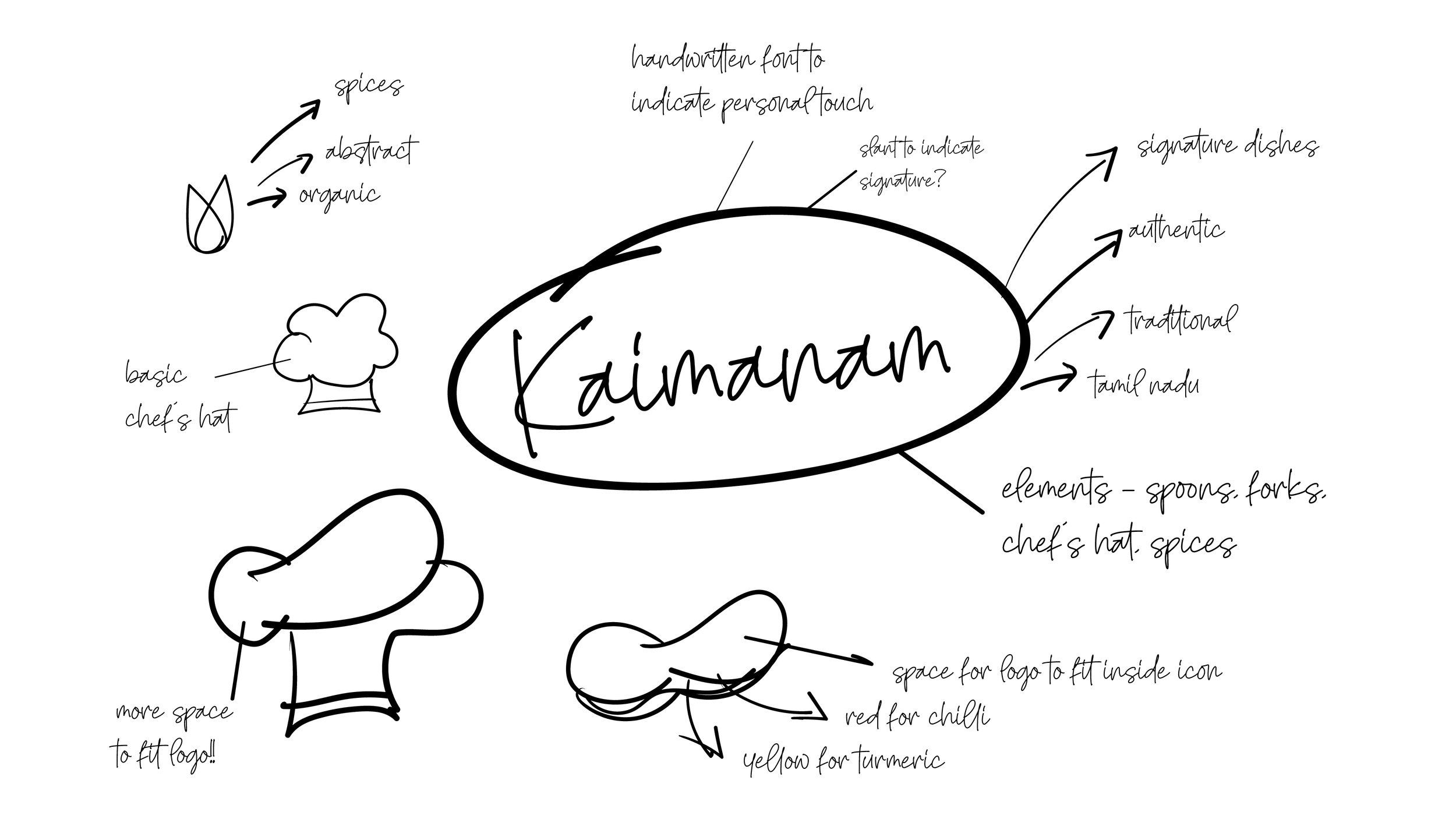
Drawing inspiration from the Tamil word "Kaimanam," which translates to the unique quality of a person's cooking, the logo design captures the essence of this essence. It's a poetic expression, signifying the 'fragrance of the hands,' it mirrors the vivid colors and intricate patterns found in Indian spices. This logo caters to a younger audience with its stylized representation, while the typography chosen reflects the organic and handcrafted nature of the cuisine, radiating warmth and hospitality.


